Tag: Interior Styling

  • Color Psychology in Paintings: How Wall Art Shapes Mood and First Impressions

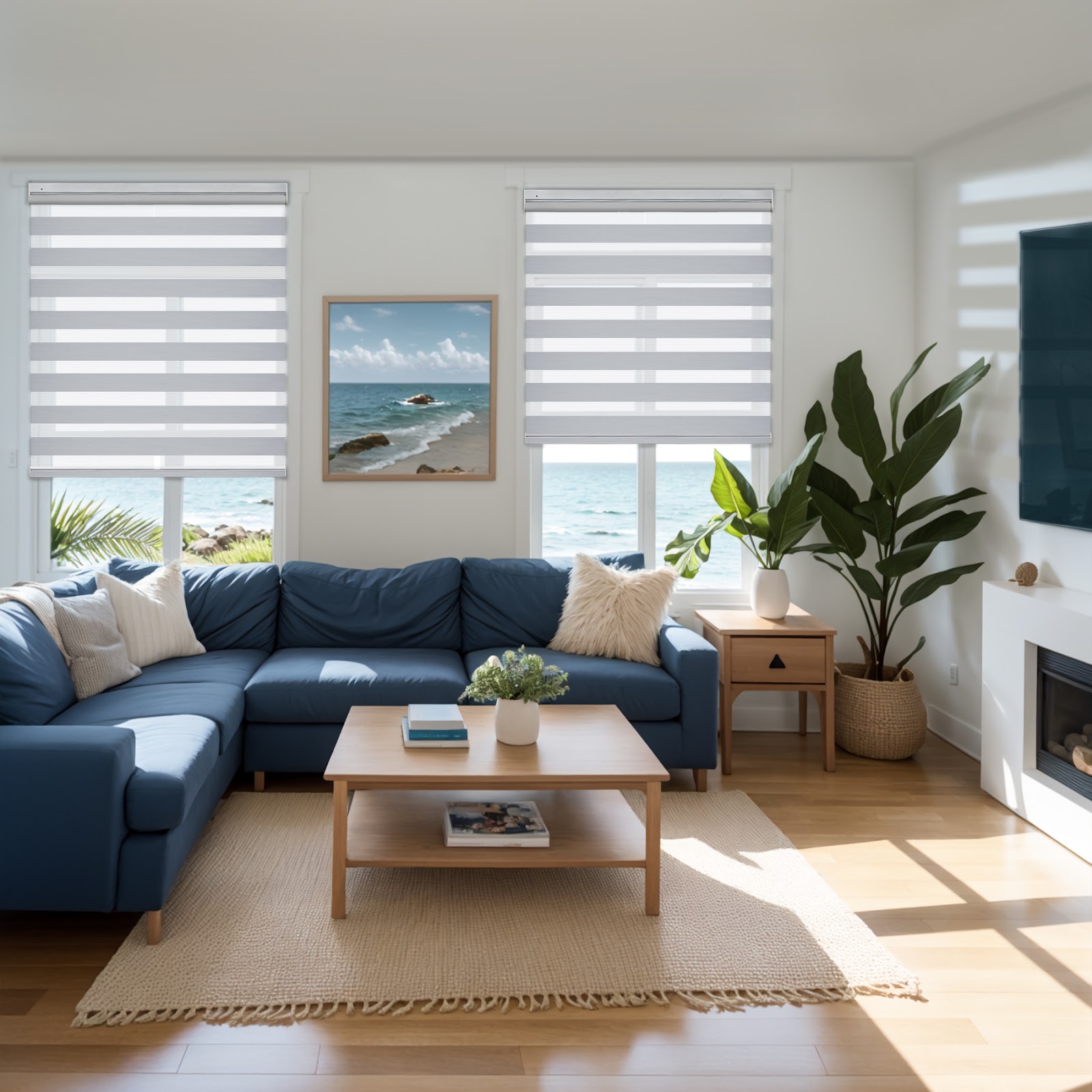
    Two homes can have the same layout, the same flooring, and even the same paint color. Yet they still feel completely different the moment you step inside.

    Often, the difference is on the wall.

    A painting is not just a nice touch. It is an emotional shortcut. Before someone notices your coffee table styling or the quality of your curtains, their brain has already clocked the dominant colors in the room. It makes a snap judgment. Is it calm? Energizing? Cozy? Cold? Luxurious? Playful? Or serious?

    That judgment happens fast. This is one reason wall art can shape first impressions more than people expect. It means paintings can do more than fill space. They can steer the mood of a room on purpose. For home design fans or anyone thinking about resale, it is equally useful. The right painting palette can make a home feel welcoming, modern, and finished without a renovation budget.

    Here is how color psychology in paintings works in interiors and how to choose art that supports the mood you actually want.

    Why Paintings Influence Mood Faster Than Decor

    Home design is full of details, but first impressions happen in a blur. When you enter a room, your brain scans for the big signals like light, layout, and color. Paintings are often one of the largest blocks of color in the space. They are bigger than a vase and louder than a pillow. They are usually placed right in your sightline.

    That is why a painting can override the mood you thought you designed.

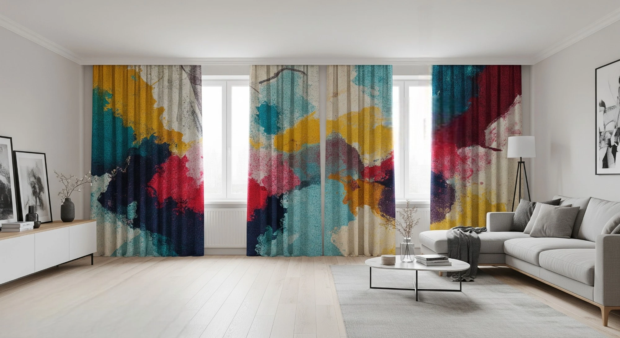
    Picture a soft beige room. Now hang a vivid red abstract painting in it. The room suddenly feels more intense, more modern, and maybe even slightly edgy. Swap that out for a hazy blue landscape. It is the same room, but it has a different emotional temperature. One invites conversation. The other invites you to exhale.

    Paintings are mood-setters because they carry color at scale.

    The Two Concepts That Matter Most

    Before picking a color, keep two things in mind.

    1. Visual temperature. Warm colors like reds, oranges, and terracotta tend to feel social and intimate. Cool colors like blues, greens, and cool grays tend to feel calm and spacious. Neither is better. They simply push the energy in different directions.
    2. Saturation and contrast. High saturation reads bold and lively. Low saturation reads refined and airy. High contrast looks dramatic and grabs attention. Low contrast feels cohesive and soothing.

    What Different Color Palettes Communicate

    Color psychology is not a strict rulebook. People’s experiences and culture matter. But in home interiors, certain palettes tend to create predictable impressions. Think of these as design signals rather than strict rules.

    Warm Tones Are Cozy and Social

    Paintings with reds, oranges, warm yellows, rust, and terracotta often make spaces feel more active and welcoming. They bring a sense of closeness. This is why warm-toned art can make large open-concept rooms feel less empty.

    • Where it works best. This palette is great for living rooms, dining areas, kitchens, and entryways.
    • What to watch for. Highly saturated reds can feel aggressive if the rest of the space is already visually loud. If you want warmth without intensity, look for warm tones in a muted, dusty, or earthy version.

    Cool Tones Are Calm and Spacious

    Blues, greens, cool grays, and sea tones tend to create a sense of calm and clarity. They can make a room feel larger and lighter, especially when the painting has soft transitions rather than sharp contrasts.

    • Where it works best. This is ideal for bedrooms, bathrooms, home offices, and modern living spaces.
    • What to watch for. If the room already has cool lighting and cool finishes like gray floors or chrome, too much cool-toned art can make the space feel cold. You should balance it with warm wood, brass, or textiles.

    Neutrals Are Timeless and Flexible

    Neutral paintings include creams, beiges, taupes, black-and-white work, and charcoal sketches. They support a quiet luxury vibe. They work well in homes that rely on texture and material quality like linen, wood grain, plaster walls, and boucle.

    • Where it works best. These work anywhere, especially in staged homes or resale properties.
    • What to watch for. Neutral art can disappear if everything else is neutral too. The fix is texture. Choose pieces with depth, visible brushstrokes, layering, or a strong focal area.

    Earth Tones Are Grounded and Natural

    Earth-tone paintings use clay, sand, olive, ochre, warm browns, muted greens, and stone grays. They feel organic and calming. They often connect modern clean lines with a more lived-in warmth.

    • Where it works best. Try these in living rooms, bedrooms, hallways, and homes with lots of wood.
    • What to watch for. Too much earth tone without contrast can feel flat. Add a little charcoal, deep green, or off-black detail to keep it intentional.

    Jewel Tones Are Luxurious and Dramatic

    Emerald, navy, burgundy, sapphire, and plum feel rich. Even a single jewel-toned painting can make a room feel more upscale, especially when paired with simple furniture and good lighting.

    • Where it works best. These shine in dining rooms, formal living rooms, offices, and boutique-style bedrooms.
    • What to watch for. Jewel tones can dominate a small space. Keep the rest of the palette quiet. You can also choose a painting where jewel tones are accents rather than the whole story.

    Pastels Are Soft and Approachable

    Dusty pink, pale blue, soft lavender, mint, and gentle peach can make a space feel bright, friendly, and relaxed. In modern interiors, pastels work best when they are slightly muted rather than sugary sweet.

    • Where it works best. Use these in bedrooms, nurseries, creative studios, and small apartments that need lightness.
    • What to watch for. Overly sweet pastels can feel juvenile in a luxury context. Pair them with structured frames, darker accents, or more grown-up textures like linen and natural wood.

    Think of your painting as either a focal statement that leads the room or a bridge piece that connects the room’s existing tones. Either approach works. Just do not try to do both on the same wall.

    Room-by-Room Guide to Mood

    Instead of asking what matches your sofa, ask a better question. How do I want this room to feel within five seconds?

    Entryway and Hallway

    Your entryway is a handshake. A painting here should feel inviting and confident. Warm neutrals, gentle earth tones, soft greens, or a balanced abstract with a calm palette work well. If your hallway is narrow, avoid highly contrasting art that acts like a visual stop sign. A calmer palette helps the space flow.

    Living Room

    Living rooms are social, but they are also where people unwind. Paintings with warm undertones often work beautifully here. Think rust, clay, warm beige, or muted gold. This works best when balanced by a few cooler touches like sage or soft blue.

    • If you want the living room to feel lively, choose higher saturation or stronger contrast.
    • If you want it to feel restful, choose softer transitions and muted tones.

    Bedroom

    For most people, bedrooms do best with low-saturation palettes. Think misty blues, dusty greens, warm neutrals, soft charcoal sketches, or gentle abstract work. A painting can still be interesting without being visually demanding. Avoid highly saturated reds or neon tones if sleep is a priority. They tend to keep the room’s energy turned on.

    Home Office

    Offices benefit from colors that support attention without raising stress. Think deep blues, forest greens, earthy neutrals, or structured abstracts with controlled contrast. If you want more creative energy, add a small amount of warmth. Burnt orange or ochre accents can stimulate without overwhelming.

    Dining Area and Kitchen

    These rooms look best with some warmth. A painting with terracotta, warm beige, or golden tones can make a dining space feel more inviting and connected. Even modern spaces look more human with art that has a warm center. If your kitchen is already warm with wood cabinets and warm lighting, you can introduce cooler art for balance. Just keep it soft.

    Bathroom

    Bathrooms tend to work well with cool tones and neutrals because they support a fresh and relaxed feeling. Stick to soft blues, sea greens, and monochrome prints. Keep the composition calm since too much visual busyness can fight the spa effect.

    Practical Tips to Choose the Right Painting

    You do not need a design degree to make this work. A few smart checks will prevent the most common mistakes.

    • Start with the purpose of the room. Put mood first and matching second. Decide what you want the space to do. Do you want to relax, energize, welcome, or focus?
    • Use the painting as the 10% color boost. In many rooms, the painting can act like the accent in the classic 60-30-10 color balance. If your room is neutral-heavy, the painting can provide that intentional pop without needing a dozen accessories.
    • Test in real light. Paintings change dramatically between daylight and evening light. View the piece in both. Step back and check it from the doorway. That is how most people will experience it first.
    • Mind undertones. A warm white wall and a cool gray painting can clash even if they look neutral on their own. Compare the whites and grays in the painting to your walls, floors, and large textiles.
    • Treat the frame as part of the palette. Natural wood frames add warmth. Thin black frames sharpen and modernize. Wide mats add breathing room and sophistication.
    • Go for mass appeal if you are selling. If your goal is first impressions for buyers or renters, soft blues, gentle greens, warm neutrals, and calm abstracts tend to feel universally comfortable. Extremely polarizing colors or aggressive imagery can distract people from imagining themselves in the home.
    • Avoid common sizing mistakes. Art that is too small for the wall, hung too high, or overly busy in a small space can make even a beautiful interior feel off. When in doubt, scale up and simplify.

    Conclusion

    Paintings are not just the finishing touch. They set the tone. Because color is processed quickly, the palette on your wall can shape how a space feels before anyone notices the details you worked so hard on.

    When you choose art with color psychology in mind, you get more control over mood and first impressions. Warm tones invite connection. Cool tones expand the space. Neutrals improve the design.

    The next step is simple. Pick one mood you want the room to deliver. It could be calm, welcoming, energized, or refined. Then choose a painting that makes that mood obvious within five seconds of walking in. When art leads with intention, the whole space feels more finished, more personal, and more memorable.

  • Integrating Revive2 Radiators Into Various Interior Layouts

    Gone are the days when radiators were just functional eyesores. The Revive2 double-panel model proves that heating can be both powerful and stylish, offering strong output from a clean, simple profile. It’s designed to elevate a room’s look without competing with your design.

    As more homeowners and designers seek heating solutions that integrate with the room rather than fight it, the Revive2 hits the mark. Its low profile fits seamlessly into modern spaces yet feels perfectly appropriate in traditionally styled homes.

    Embracing Modern Minimalism

    Minimalist rooms thrive on open space, clean lines, and a soft, neutral palette. The Revive2 double panel radiator has a flat front and compact depth, making it a great match for this aesthetic. It sits quietly in the background, allowing the space to feel calm while maintaining steady, comfortable heat.

    Key features for modern spaces:

    • A sleek profile that slips into tight spots while still looking sharp.
    • Versatile finishes, allowing you to either blend the radiator into the wall or use it as a gentle accent.
    • Compact sizes that maximize floor space in small apartments without sacrificing solid heating power.

    In a modern setting, try placing the radiator under windows or along an open wall. Just be sure to leave a few inches of clearance on all sides for airflow, this keeps the unit efficient and maintains that open, uncluttered layout.

    Vintage Charm in Traditional Homes

    For classic interiors, the goal is to add warmth that feels intentional and integrated. The Revive2’s simple, understated shape doesn’t clash with ornate wood trim, crown molding, or other period details.

    Harmony with traditional features:

    • Blend with the woodwork: Align the unit with existing sills and trim so it reads as a deliberate part of the millwork.
    • Choose warmer tones: Opt for paint or enamel finishes (where available) that echo the home’s historic color palette.
    • Use feature placement: Center the radiator under a piece of art or between built-in shelving to make it look intentional, not like something you tried to hide.

    By letting the radiator coexist with your vintage pieces, you maintain modern comfort while fully respecting the home’s original character.

    Making the Most of Compact Spaces

    Urban layouts and smaller homes demand heaters that work hard without eating up valuable square footage. The Revive2’s double-panel design is ideal for this, delivering impressive output from a very small footprint.

    Smart solutions for small living areas:

    • Utilize overlooked walls: Install radiators in hallways or entryways to free up main living space while warming the home’s core.
    • Pair with multi-purpose furniture: Place furniture near the unit (never touching) so air can circulate and surfaces remain safe.
    • Go vertical: Choose a tall, vertical model instead of mounting a standard unit high on the wall. This ensures heat spreads evenly rather than pooling uselessly at the ceiling.

    In tight layouts, every inch counts. Keep fabric drapes, long curtains, and deep sofas pulled slightly away from the radiator’s face to ensure proper airflow and heating efficiency.

    The Efficiency Aspect

    Energy efficiency is top-of-mind for most homeowners. A modern radiator, especially when paired with smart controls and set to the right water temperature, can significantly cut energy waste while keeping your room perfectly comfortable.

    Energy efficiency benefits:

    • Fast warm-up: The double-panel design and convector fins help rooms reach the target temperature quickly, which means shorter boiler cycles.
    • Durable construction: Quality steel construction extends the unit’s service life, leading to fewer replacements and less waste.
    • System compatibility: When sized correctly, it works efficiently with modern systems, including condensing boilers and low-temperature heat pumps. It also pairs perfectly with smart thermostatic radiator valves (TRVs).
    • Better zoning: Using thermostatic valves allows you to heat only the rooms you’re actually using, dramatically reducing energy consumption.

    Bringing It All Together

    The Revive2 is versatile enough to fit a wide mix of layouts, allowing you to maintain a minimal look, honor traditional details, maximize a small floor plan, or meet efficiency goals. Its clean style and reliable output make it a go-to choice for discerning homeowners and designers alike.

    Tips for successful integration:

    • Plan ahead: Sketch your room layout and get a basic heat-loss estimate. This ensures the size you pick will actually heat the space.
    • Test finishes: View finish samples in your room against your walls, floors, and fabrics to see how the color looks in your specific lighting.
    • Consult a pro: Talk with your heating professional or interior designer about placement, valve choices, and system balancing to guarantee smooth, even heat.
    • Mind your clearances: Leave adequate space above, below, and in front of the unit. Keep furniture at least a few inches away for optimal airflow and safety.
    • Bleed and balance: After installation, make sure the system is bled and balanced so every room warms up evenly and your boiler or heat pump isn’t working harder than necessary.
    • Use smart controls: Pair the unit with a programmable thermostat or smart TRV heads to set schedules and trim energy use automatically.

    With a bit of planning, the right radiator stops being an afterthought and becomes an integral part of your design. The result is steady comfort, a cleaner aesthetic, and more sensible energy use all year round.

  • Modern Window Treatment Trends for Stylish Homes in 2025

    Blinds and curtains might seem like small details, but they can completely transform a room. In today’s homes, window treatments have become essential elements of interior design. More homeowners are considering how curtains, blinds, and shades enhance the overall look and feel of their spaces. This year’s trends blend style with practicality, creating clean, beautiful, and inviting interiors.

    Let’s explore the most popular window treatment ideas defining stylish homes in 2025.

    Smart Choices: Sustainability and Standout Materials

    Sustainability is playing a bigger role in home design, and window treatments are no exception. Many homeowners now opt for eco-friendly materials like organic linen, bamboo, and recycled fabrics. These choices are good for the environment and bring a natural, stylish touch to interiors.

    More treatments now feature biodegradable fibers and low-VOC dyes. Some brands are even using recycled plastics to create durable and attractive fabrics. This growing shift toward sustainable materials reflects a broader desire for homes that are both beautiful and eco-conscious.

    A Smart Upgrade: Smart Motorized Shades and Blinds

    Technology is deeply integrated into modern homes, and window treatments are evolving alongside it. Smart motorized shades and blinds are changing how we manage light, privacy, and energy use. These treatments sync with smart home systems, allowing control through voice commands, apps, or automated schedules.

    By 2025, motorized shades are quieter, more energy-efficient, and better looking than ever. Many models integrate with Google Home, Alexa, or Apple HomeKit, making adjustments effortless. Some even use AI to learn your routines and adjust automatically, combining convenience with energy savings.

    Stylish and Attractive: Soft Neutrals and Artistic Prints

    Artistic prints and subtle patterns are making a comeback. Geometric designs, watercolor motifs, and nature-inspired prints are showing up on curtains, shades, and even motorized blinds. These patterns add character without taking over the room.

    Paired with a trending color palette of soft neutrals and earthy tones—like beige, taupe, warm gray, and muted green—they create a calm yet stylish aesthetic. This year’s focus is on combining bold prints with timeless design for a look that feels both modern and grounded.

    Layered Window Treatments for Depth and Texture

    Layering is a big trend in 2025, adding both style and functionality to rooms. Sheer curtains combined with heavier drapes or woven wood shades help manage light, privacy, and insulation. Sheer fabrics soften sunlight while keeping rooms bright and airy.

    When paired with blackout drapes or Roman shades, these layers create a flexible setup that adapts throughout the day. Textured materials like bouclé, velvet, and jute are also trending, offering warmth and visual depth to modern interiors.

    Neat and Clean: Minimalist and Streamlined Designs

    Minimalist window designs are popular in 2025, focusing on clean lines and simple, elegant looks. Roller shades, panel tracks, and sheer drapes in soft, neutral colors create a tidy and modern feel—perfect for contemporary homes.

    Flush-mounted shades, which fit inside the window frame, are especially trendy for their seamless look. These designs are great for homes that value simplicity and practicality. The focus is on high-quality materials and precise stitching, making even the simplest styles look refined and stylish.

    Personal Touches: Custom and Unique Window Treatments

    In 2025, personalization is a major trend in window treatments. Homeowners want options that match their specific needs and tastes—custom sizes, exclusive fabrics, and handcrafted details.

    Custom designs allow people to create truly unique looks. Think floor-to-ceiling drapes, hand-painted blinds, or motorized shades with one-of-a-kind prints. Designers and artisans are working together to craft one-of-a-kind pieces that express personal style and enhance a home’s character. Custom treatments add a tailored touch that seamlessly fits your home’s design.

    Return of the Skylight Shades

    Skylight shades are making a comeback, updated with modern materials and sleek finishes. These window coverings combine form and function, making them ideal for various rooms in stylish homes.

    Skylight shades made with textured fabrics, light-diffusing materials, or advanced thermal layers are in high demand. They offer energy efficiency, a soft appearance, and a cozy atmosphere. Their neat design looks discreet when open and provides full coverage when closed—delivering both comfort and style.

    Organic and Stylish: Natural Wood and Woven Window Shades

    Natural wood and woven shades are in high demand as the organic modern trend continues to rise. Materials like bamboo, rattan, and grasscloth add warmth and depth while maintaining a clean, modern aesthetic.

    Woven wood shades offer varying levels of light control and privacy. They pair well with both soft and bold palettes, making them a timeless choice for elegant interiors. In 2025, we’ll see more innovative designs that blend wood with fabric or metal for a fresh, unique twist.

    Modern Window Solutions: Blackout and Light-Filtering

    Blackout and light-filtering window treatments are evolving to meet modern needs around wellness and comfort. New blackout fabrics can block nearly all light while still offering a soft, luxurious look.

    Some blackout curtains now include thermal insulation to help regulate indoor temperatures and reduce energy costs. Light-filtering options have also advanced, with materials that gently diffuse sunlight to create a cozy, welcoming glow ideal for bedrooms, home theaters, or workspaces.

    Sleek and Shiny: Metallic and Glossy Finishes

    Metallic and high-gloss finishes are trending in 2025, adding a chic touch to any space. Gold, brass, and chrome accents on curtain rods, blinds, and shutters elevate the overall design. Glossy finishes on Venetian blinds and shutters create a polished, contemporary look that fits both residential and upscale commercial interiors.

    These reflective surfaces help bounce natural light around the room, making it feel brighter and more spacious.

    Biophilic Design: Nature-Inspired Window Treatments

    Biophilic design which emphasizes our connection to nature, continues to shape window treatment trends. Leaf-patterned sheers and botanical-printed shades bring the outdoors in. Large, uncovered windows are loved for their clear views and openness.

    When privacy is needed, retractable screens or light, sheer drapes are popular options that preserve the view while offering a soft layer of coverage. These designs beautifully blend function with a love of nature.

    Conclusion

    Window treatment trends in 2025 are all about blending innovation, sustainability, and personal style. From smart motorized shades to custom eco-friendly fabrics, today’s options offer both form and function. With the right choices, window treatments can elevate your home’s aesthetic while supporting your lifestyle and values. Keego Blinds has the perfect window solutions to help you style your space just the way you like it.