
You’ve probably walked into a beautifully decorated room that somehow still felt… off. The furniture was gorgeous, sure, but moving around was awkward, and maybe the seating didn’t really invite conversation. That’s a classic mistake: focusing so much on how a space looks that we forget how it’s supposed to work.
A great room layout is the backbone of good design. It’s what makes a room feel natural to be in. Without it, even the priciest furniture and the most stylish decor can fall flat. You’re not just designing something that photographs well, you’re creating a space that feels right when you live in it, day after day.
And this is where a lot of people get stuck. You know what you like, but turning that into a floor plan that actually functions? That part’s tough. It doesn’t have to stay that way. Design tools have come a long way, and today, it’s easier than ever to go beyond pretty and build a layout that truly works.
The Twin Pillars: Understanding Function and Flow
Before you move a single piece of furniture, it’s worth stepping back and getting clear on two key principles that shape every great room layout: function and flow.
1. Function: What is this room for?
It might seem like an obvious question, but it’s one a lot of people skip. Before you decide where anything goes, you need to know exactly how the space will be used. Will the living room be your go-to spot for movie nights? Or is it more of a gathering space for friends and family to sit and talk? Maybe your dining room doubles as a part-time office during the week.
Be honest about how you live. A setup designed for formal dinner parties won’t work if most of your meals happen on the couch in front of the TV. Once you’re clear on the room’s main purpose, think about the secondary ways you’ll use it too. This kind of clarity becomes your anchor, it helps you figure out what furniture you actually need and where it should go.
2. Flow: How do people move through the space?
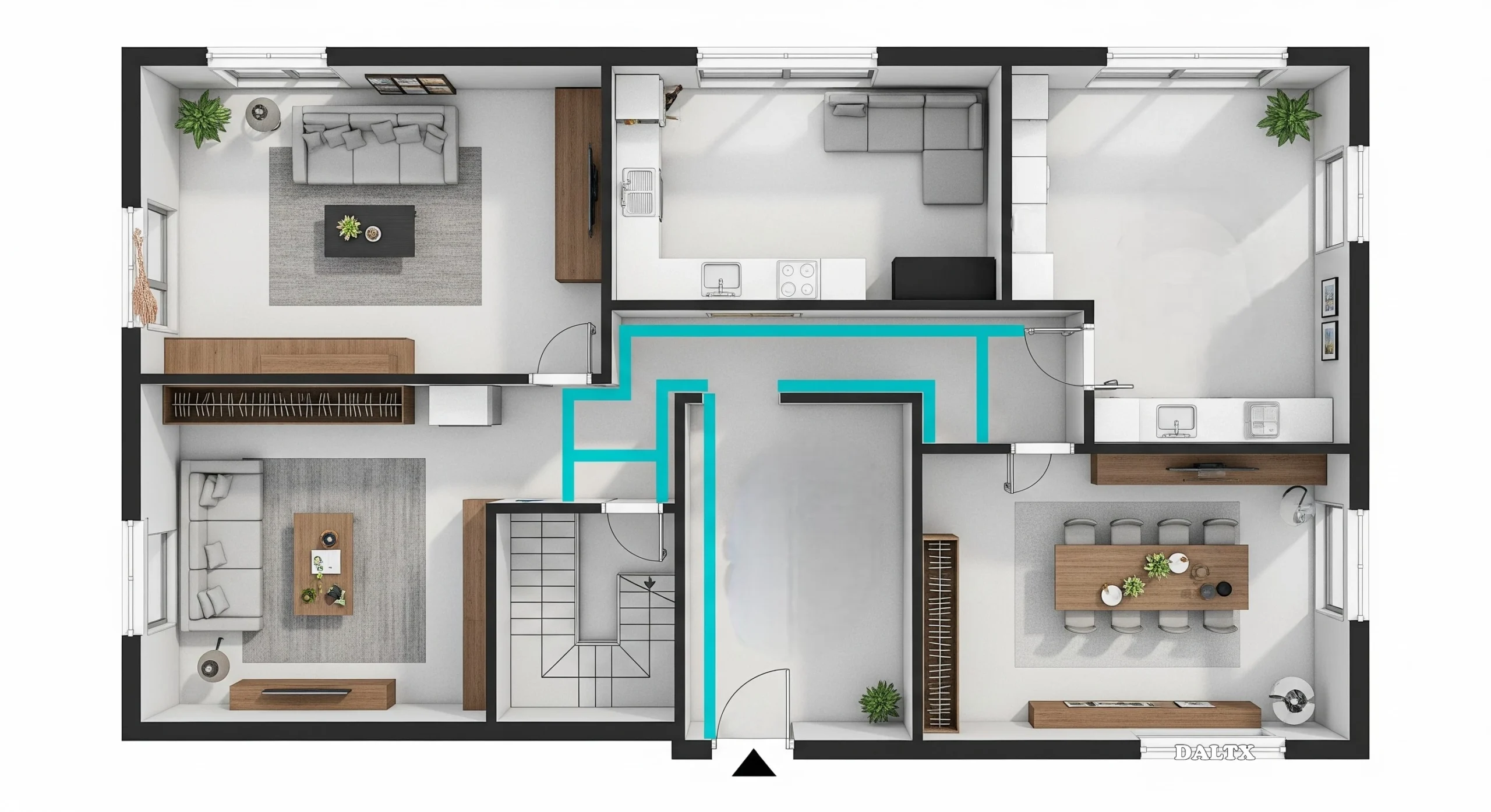
Flow is about movement. It refers to the natural paths people take when they walk through a room or between rooms. When flow is off, you might not be able to pinpoint why a space feels awkward, but you’ll definitely feel it. Bad flow leads to tight corners, furniture you have to shuffle around, and just a general sense of discomfor
One of the most common layout mistakes is pushing all the furniture up against the walls. It sounds like it would open up the room, but more often than not, it leaves a dead zone in the middle that doesn’t really serve any purpose. A better approach is to create intentional paths that feel easy to move through. Ideally, your main walkways should be around 24 to 36 inches wide so people can move around comfortably without bumping into anything.
The Old Way: Guesswork and Costly Mistakes
Before digital tools became widely available, if you wanted to plan out a room, you’d need a ruler, graph paper, and a lot of patience. People would cut out little paper pieces to stand in for furniture and then slide them around, trying to picture how everything might work in real life. It wasn’t fun and it wasn’t very accurate either.
It was hard to really see it.
Drawings are flat. Rooms aren’t. You can sketch where the couch goes, but you can’t feel how tight the walkway gets, or how that table might block the view across the room. That disconnect often leads to mistakes, sometimes expensive ones.
A piece of furniture might look great on paper. Then it arrives, and suddenly it’s either swallowing the whole room or looks like a dollhouse version of what you had in mind. Judging scale on a page is harder than it sounds.
If you wanted to try a new setup, you’d basically have to redraw the whole thing. It was time-consuming and honestly pretty frustrating. A lot of people gave up and just went with whatever layout they landed on first. Even if it didn’t feel quite right.
So what happened? They’d order the wrong sofa. Or realize the space doesn’t work after everything’s already been delivered. Then they’d end up spending more to fix it later.
Visualizing Your Layout in 3D
Technology has completely changed how we plan spaces. Instead of struggling with flat drawings and vague ideas, you can now use 3D tools to build a true-to-scale version of your room and move things around in real time.
It really is a game-changer. Rather than trying to picture how a layout will feel, you can see it. You can drop in furniture, walk through the room virtually, and try out different setups until something just clicks. You’ll know if a chair blocks the hallway or if the dining table feels too close to the wall, all before buying a single thing.
What used to require expensive software and design experience is now available to anyone. There are platforms that let you design a room online free, giving you full control to explore different ideas and make changes on the fly. And because you’ve already “lived” in the layout virtually, you can move forward with a lot more confidence. No more surprises when the real furniture shows up.
A Step-by-Step Guide to a Layout That Works

So you’ve got the right tools and a better understanding of function and flow—now what? Here’s how to bring it all together using a 3D design platform to build a layout that feels just right for your space.
- Start with a focal point.
Every well-designed room needs something that draws the eye. It might be a fireplace, a big window with a view, a bold piece of art, or even the TV. Whatever it is, let that be your anchor. Arrange your main seating so it naturally faces the focal point. Doing this sets the tone and helps everything else fall into place. - Make space for conversation.
Furniture isn’t just for sitting, it sets the stage for connection. Try placing a sofa and two chairs in a loose U-shape or H-shape. The goal is to keep people close enough to talk comfortably without raising their voices. A good rule is to leave about 4 to 12 inches between two chairs so there’s room for a small table, but not so much space that the room feels disconnected. - Let your furniture breathe.
It’s tempting to push everything against the walls, but you don’t have to. By floating your sofa or chairs just a bit toward the center, you create a more dynamic room. It opens up natural pathways behind the seating, makes conversation areas more defined, and often makes the space feel larger too. - Watch your spacing.
Little gaps make a big difference. You’ll want to keep your coffee table around 12 to 18 inches from the front of the sofa, that’s close enough to reach, but not so tight that it’s awkward to move around. And when it comes to walkways, try to keep main paths at least a couple of feet wide so moving around feels easy and natural. - Use a digital tool to test and tweak.
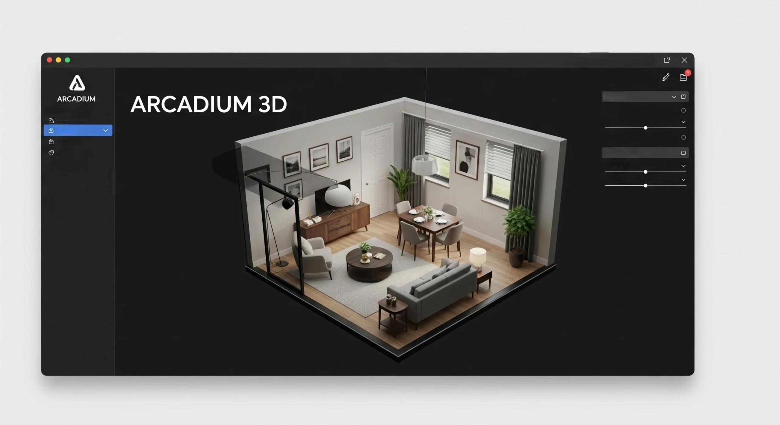
This is where everything starts to click. A platform like Acradium 3d lets you play with different layouts without moving a single piece of real furniture. You can drag and drop items from a huge library, explore the room in 3D, and even take a virtual walk-through to see how things feel. You’ll be able to try out a bunch of versions quickly and land on the one that actually fits your space and the way you live
Design a Life, Not Just a Room

It’s easy to get caught up in colors and finishes and finding the perfect coffee table.A good room is about shaping a space that feels like it truly fits into your everyday life, something that flows with your routines, supports what you do, and makes being at home feel just a little easier.
Think about the way you move through the space. What you do there every day. What makes it easier, what gets in your way, what feels right and what feels off. That’s what layout is really about.
You don’t have to guess anymore. You don’t have to stand there with a tape measure wondering if the sofa will fit or if you’ll regret placing that chair in the corner. Now you can test things out. You can move furniture around with a few clicks. You can see it. You can feel it before you even make a decision.